Bokeh
posted: August 22, 2010 at 06:00 PM categories: css3, animation, webfonts, filters view comments
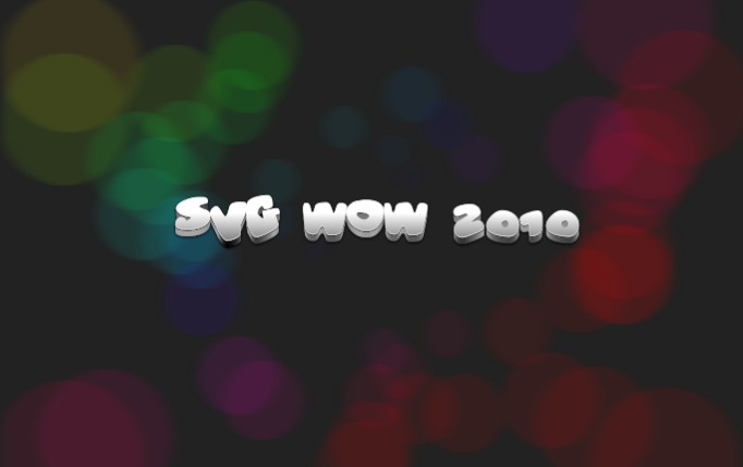
Bokeh effects, which in simple terms is in-focus objects in front of an out-of-focus or blurred background, come in many different forms, as you can see on Flickr for example.
In this demo some circles are generated by javascript. The circles are added to the background, given some nice colors and blurred a bit to create a faux bokeh effect.
As you will notice from reloading the demo, the position of each circle is random, and the radius depends on the distance from the center of the svg image. The further away from the center a circle is the larger the radius. The computed radii are then used for dividing the circles into three different blur levels. Finally the color of the each circles depend on its computed position. CSS3 hsl color syntax is used to provide every circle with a fill-color that is similar to all the nearby circles.
After the circles have been generated they are added to the background group element which happens to have a 'buffered-rendering' attribute set to 'static'.
The 'buffered-rendering' attribute tells the browser it's probably a good idea to cache the rendering of that subtree. In essence it's like having the same thing as a pre-rendered raster image, but with the added benefits that SVG provides. E.g if you ever need to resize or update the subtree you can, just remove the 'buffered-rendering' attribute and it will behave as normal again. In browsers that don't support 'buffered-rendering' the SVG rendering will be unaffected by the attribute.
To see the effect of 'buffered-rendering' click the svg image and the text will animate on top of the background.
The demo uses the Vitamin font.
Pointilizer
posted: August 22, 2010 at 06:00 PM categories: canvas, animation, raphaeljs view comments
This example shows a combination of html5 canvas and svg.
First, a raster image is processed by canvas and javascript to extract part of the pixel data as an array of points, relative size and color. The result is then passed to a small javascript function that uses the Raphaël framework to render the result, which in theory provides support all the way back to IE6. However, since the demo needs support for canvas to get any interesting results, you'll need at least IE9. The animation is done by the API provided by Raphaël, which is much less rich than what SVG in itself is. However, it shows that it's easy to animate vector graphics even in browsers that don't yet support SVG's declarative animation elements.
It's easy to extract the points data from raster images, it's wrapped into a utility function called sw.tools.pointilize which is provided by
pointilizer.js.
You provide an options array and a callback function. Here's an example of how it can look:
sw.tools.pointilize({
    url: "somephoto.jpg",
    output: "points",
    points: 1000,
    threshold: 0,
    width: 480,
    height: 360,
 },
 function(result) {
    // your callback function
    if (result.data)
    {
        // do something with the data
    }
});
The result.data that is passed back depends on the output format, if you pass "svg" instead it'll be a string that is the serialized svg image. The string can be
inserted into the DOM by using DOMParser or element.innerHTML. DOMParser is supported by all browsers except IE, and parses a string
into a DOM, it can handle both html and XML documents. The element.innerHTML setter which is defined in HTML5 is available on all browsers, but at the time of
writing shows differences in how it handles XML input, and deployed older browsers will not handle the svg elements correctly. It's recommended to not rely on one single
way, but instead gracefully fall back and handle such differences in the javascript code, testing for the functionality and not for a particular browser.
Following that advise will provide you the best level of compatibility for your content.
Note that for the canvas data extraction to work you need to host the image and the script on the same domain, since the browsers generally throw a security exception if you try to read pixels from images that were from another domain.
Camera
posted: August 14, 2010 at 06:00 PM categories: interactivity, camera, animation, yui, audio view comments
Download Video: WebM | MP4 | OGG
Running the demo
Click on the "Start SVG Demo" at the top of this page. After the loading message disappears, click in the display area to start the demo.
Using the camera metaphore to script zoom and pan
Sometimes, we only think of animation as moving objects, changing their sizes, positions or other properties. This demo shows that we can also create animation effects by moving a 'camera' around.
The camera effect is created
by animating the
transform
on a target <g> in the SVG content,
which creates the illusion of a camera moving over the group of
elements contained in the target group.
Camera utility
The demo uses a small utility camera.js which makes it easy to create this type of effect.
Following is a sample of how to instantiate, configure and start
the camera with the action method.
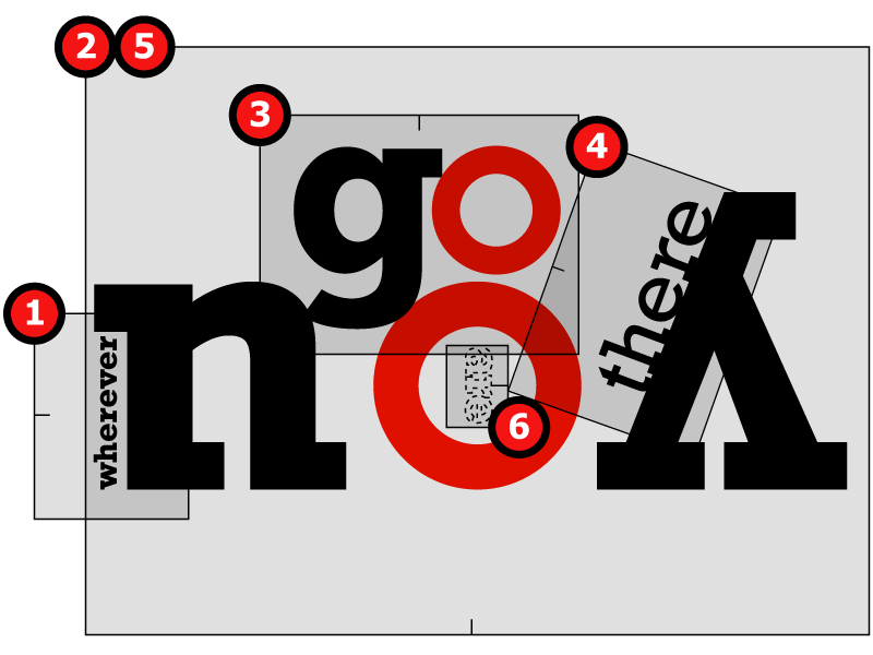
var cameraTarget = Y.one('#cameraTarget'), // Uses YUI 3.0 for DOM access.
    Easing = Y.Easing;
var defaultInterpolators = {
    zoom: Easing.easeNone,
    direction: Easing.easeBothStrong ,
    position: Easing.easeBothStrong
};
var camera = new sw.tools.Camera({
    target: cameraTarget, // The element containing the content to navigate over
    viewport: {width: 800, height: 600}, // The camera's viewport
    frameLength: 10,  // Controls the camera's movement speed.
    position: {x: 243, y: 68}, // The camera's initial position
    direction: 90, // The camera angle
    zoom: 7 // The camera's zoom level.
    });

    camera.addTravelSegments([{
        name: "wherever",
        position: {x: 243, y: 384},
        direction: 90,
        zoom: 7,
        runLength: 1000,
        interpolators: defaultInterpolators
    }, {
        name: "you",
        position: {x: 440, y: 368},
        direction: 180,
        zoom: 1.6,
        runLength: 2000,
        interpolators: defaultInterpolators
    }, ... // More camera positions
});

camera.action();
The following figure illustrates how the zoom level, direction and position specify the successive positions of the camera over the composition.
Attributions
Many thanks to Roger Kidd for creating this demo's rythmic arrangment.
Alternate Stylesheets
posted: August 14, 2010 at 06:00 PM categories: style view comments
Running the demo
Click on the "Start SVG Demo" at the top of this page. Then, in the demo page, select the name of the alternate stylesheet to apply
Click on the 'start svg demo' button on this page. Then select one of the links next to the 'select stylesheet' prompt to to enable the desired stylesheet (and disable the others).
Applying CSS styles to SVG and HTML from one stylesheet
SVG is fully stylable with CSS and features like alternate stylesheets apply. This demo shows a web page with both HTML and SVG content. At the top of the page, the user can select one of the available stylesheets which gets enabled while the others are disabled. This mechanisme is generally useful to allow users to select a prefered style, for example chosing high contrast if needed for accessibility reason.
The demo shows how the style of SVG graphical element is subject to CSS styles, just like any other HTML element is and that the same stylesheet can naturally be used to style both SVG and HTML content.
The key to turning stylesheets on or off is to change the
disabled property on the <link>
element referencing the stylesheets like so:
var link = ...; // e.g., from document.getElementsByTagName("link");
link.disabled = false; // Enables the stylesheet
....
link.disabled = true; // Disables the stylesheet
The code for turning stylesheets on and off was inspired by the example found at A list appart.
 For updates follow us on twitter.
Categories
Archives
- March 2011 (1)
- October 2010 (1)
- September 2010 (3)
- August 2010 (4)
- October 2009 (12)
- July 2009 (1)