picture-shuffle
posted: September 18, 2010 at 06:00 PM categories: css3, yui, canvas, animation, html5 view comments
Download Video: WebM | MP4 | OGG
Running the demo
Click the 'start svg demo' button on this page. When the page is loaded, you can click on one of the picture stacks at the bottom. The stack will be dispatched to form a full picture. You can click anywhere on the image to fold it back into a stack.
Creating a polaroid collage from picture cut-outs
The idea for this demo came from my son Romain who came back from an Adobe Photoshop course he was taking. Romain showed me a polaroid collage effect he had created. The effect was quite nice, similar to some you can find on the web if you look for Photoshop polaroid effect. Of course, being an SVG geek, I thought about how this could be done in SVG, and I started hacking away a few days before the SVG Open 2010 conference where this demo was first shown.
I also decided that I wanted the demo to go a little beyond what people do in photoshop, where the content of the Polaroid collage is perfectly aligned, which helps readability but is a bit unrealistic. I wanted the individual images to be slightly missaligned, as they would be if you had a real stack of Polaroids that you were assembling into a collage.
From idea to implementation
For this to be easier than in Photoshop, the demo had to let the code just point to an image and then automatically slice it up in individual Polaroids that would be assembled into the collage.
I first used a full SVG solution, using the
<pattern> element. It did the job
functionally. Unfortunately, most implementations (except Safari),
could not handle the number of <pattern> elements
that had to be created. The performance problem got worse when a
drop shadow effect got added to the individual Polaroids and in some
cases (i.e., browsers which do not support SVG filter effects), the
drop shadow was simply not an option.
So, I had to turn to something else.
Canvas to the rescue
The solution that I ended up implementing uses a mix of SVG and Canvas, and I think it is a great example of how the two technologies complement each other.
Canvas is used to create the Polaroids and render the right content from the original picture, border and drop shadow as illustrated bellow.

Figure 1: desired result |

Figure 2: one Polaroid |

Figure 3: offscreen rendering: content, border and drop shadow. |
// Canvas where the image to slice up is rendered once.
var imgCanvas = ...;

// Canvas an context where each Polaroid 'snapshot' is drawn.
var snapshotCanvas = ...,
    snapshotContext = snapshotCanvas.getContext('2d');

/**
 * Renders a snapshot of the image with the polaroidSize and centered on
 * (cx, cy) with a rotation of r degrees. Some random noise is added to these
 * values to create a more realistic rendering.
 *
 * @param cx the exact image center on the x-axis
 * @param cy the exact image center on the y-axis
 * @param r the exact rotation, for a perfect picture alignment
 */
function snapshot (cx, cy, r) {
    var p = 0.01; // alignmentRoughness
    var ar = (1 - p + 2 * p * Math.random()) * r,
        acx = (1 - p + 2 * p * Math.random()) * cx,
        acy = (1 - p + 2 * p * Math.random()) * cy;

    snapshotCtx.save();
    snapshotCtx.clearRect(0, 0, polaroidSize.width, polaroidSize.height);
    snapshotCtx.translate(polaroidSize.width / 2, polaroidSize.height /2);
    snapshotCtx.rotate(-ar * Math.PI / 180);
    snapshotCtx.translate(-acx, -acy);
    snapshotCtx.drawImage(imgCanvas, 0, 0);
    snapshotCtx.restore();
}

// Use further code to render the border and drop shadow.
Once each
Polaroid is created, it is transfered to an SVG <image>
element like so:
var canvas = ..;

// Draw content, border and drop shadow into canvas
// ...

// Convert canvas content to a dataURL
var dataURL = canvas.toDataURL();

// Set the dataURL on an SVG <image>
var image = document.createElement(svgNS, 'image');
image.setAttributeNS(xlinkNS, 'href', dataURL);
Animating with YUI SVG Extensions
Like for many other demos on this web site, the animations are created
with YUI
SVG Extensions. There is an animation of the transform
attribute for each
<image> element.
The same animation is used both to dispatch the image from
the stack to its position and to fold it back into the stack. This
is done by using the
reverse animation property.
// Reverses the animation when it ends: change its 'direction' and
// also adjust its duration, depending on whether it is dispatching
// or folding back. The duration is in the [0.15, 0.30] seconds range
// for folding back and in the [0.25, 0.5] for dispatching.
function getReverseHandler (a) {
    return function () {
        a.set('reverse', !a.get('reverse'));

        if (a.get('reverse') === true) {
            a.set('duration', 0.15 + 0.15 * Math.random());
        } else {
            a.set('duration', 0.25 + 0.25 * Math.random());
        }
    };
}

// Iterate over all the images created from the canvas dataURLs
while (image !== null) {
    // ...
    anim = new sw.animation.Animate({
        node: image,
        from: {
            transform: {
                r: c.r + 90,
                tx: stackPosition.x + 10 - 20 * Math.random(),
                ty: stackPosition.y + 10 - 10 * Math.random()
            }
        },
        to: {
            transform: {r: c.r, tx: c.cx, ty: c.cy}
        },
        transformTemplate: "translate(#tx, #ty) rotate(#r) " +
                           "translate(" + (-c.cx) + "," + (-c.cy) + ")",
        duration: 0.25 + 0.25 * Math.random(),
        easing: Y.Easing.easeOutStrong
    });
    // ..
    anim.onEnd(getReverseHandler(anim));
    // ...
}
Note how the end handler also changes the animation's duration, so that folding back the pictures is faster than dispatching them. There is also some randomness used on the animation duration to give the effect a more realistic feel.
SVG and Canvas: Great complements
This demo showed how SVG and Canvas can be both used advantageously:
Canvas is used to slice images and create pre-rendered Polaroids with
their border and drop shadows while SVG is used to easily manage
interactivity and animation on individual <image>
elements. It is great that we have a way to move pixel data from
Canvas to SVG with the dataURL. It would be even better if there
was an API to directly move pixel data between Canvas and SVG without
having to go through
Base64 encoding which is wasteful in memory and
performance.
Small use of <foreignObject>
The instructions on the demo area are displayed by embeding HTML
content inside a <foreignObject> element.
Graffitis
posted: September 06, 2010 at 06:44 PM categories: css3, canvas, yui, animation, html5, interactive view comments
Download Video: WebM | MP4 | OGG
Running the demo
Click the 'start svg demo' on the page. When the page is loaded, it has the following header:
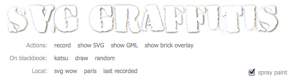
You can do several things (which are explained later on):
- select one of the predefined graffitis following the 'On blackbook' label and see them rendered with SVG and Canvas. There are two predefined graffitis: one is 'draw' from an unknown contributor and the other one is 'katsu' from Katsu.
- select the random link and see an random graffiti from the http://000000book.com/ (black book) graffiti repository.
- select the 'record' button and click and drag in the black drawing area to draw strokes. To start a new stroke, release the mouse and the click and drag to draw the new stroke. When you are done recording the graffiti, you can select the 'play' button to see it rendered with SVG and Canvas
- export the graffiti as SVG when clicking on the 'show SVG' button.
- see the graffiti's GML source when clicking on the 'show GML' button.
- show an alternate rendering of the graffiti using the 'overlay' filter by clicking on the 'show brick overlay' button.
The 'spray paint' check box turns the Canavs rendering on or off.
Graffitis and the Graffiti Markup Language (GML)
Graffitis go from the simplest scribbles to the most sophisticated artwork, as you can see on Flickr for example.
There is amazing work done to capture graffiti drawing and render them with computers graphics. Some renderings are absolutely stunning, as the work done by Chris Sugrue and Evan Roth shows.
The graffiti data is captured in the Graffiti Markup Language, GML. http://000000book.com/ (black book) is a repository of GML graffitis. Graffitis can be created with applications such as FatTagKatsu for the iPhone to draw tags and upload them to the Blackbook repository.
Using SVG and Canvas together
This demo uses and manipulates GML JSON data to render and animate
tags in the blackbook tags repository.
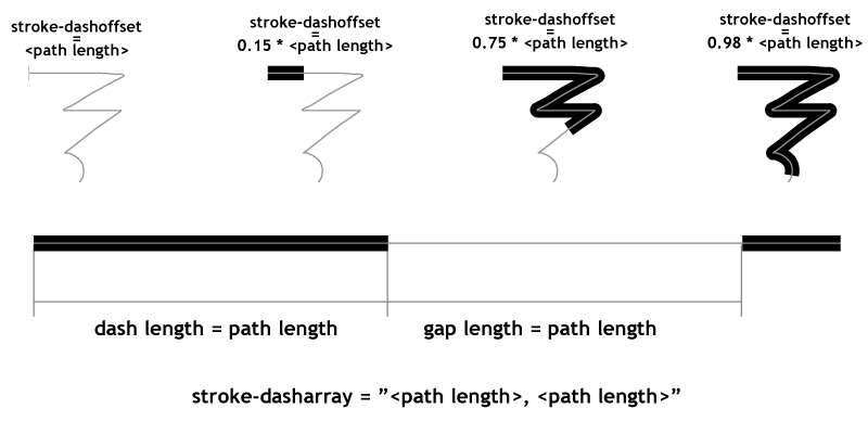
The graffiti data is turned into a number of SVG <path>
objects and the 'drawing' effect is simply done by animating the
stroke-dashoffset on the different path elements.
The getTotalLength method on the
SVGPathElement interface provides the length for each
path and lets the code compute the proper stroke-dashoffset
value. This is illustrated in the following figure.
The rendering also uses the Canvas API
to draw particles of paint as the stroke gets rendered. The particles are sprayed based on the
speed of the pen as it moves along the graffiti. The canvas with the particles is
part of the SVG tree, as a child of a foreignObject element,
which demonstrates how well the two rendering models can be combined.
The demonstration also shows how to simply create a GML file: when the user selects the 'record' button, he/she can the draw on the canvas and then select the 'play' button when done. This will render the rendering of the captured GML content.
An 'overlay' filter effect lurking in a corner
Finally, the demonstration illustrates an overlay filter effect.
The overlay compositing rule does not come directly in SVG as
it is not part of the
<feBlend>
modes. However, it is possible
(even though a bit computation intensive) to create an overlay by
combining the 'multiply' and 'screen' modes of <feBlend>.
This is a bit of a sophisticated filter which I'll further describe
in a separate demo decicated to just that filter.
An ugly hack also lurking
Several implementations (Firefox 3.6, Safari 5.0 and Chrome 6.0) have a
bug at the time of this writing and fail to correctly render stroke line
joins when the path points are closer than the stroke width. The code
contains an ugly hack to get the
visually correct result. The hack consists in adding
circles at the point poisitions to make sure the line joins are properly
rounded. This is ugly because it adds to the DOM load (many
<circle> elements are added) and slows down the
animation.
The page header uses the HVD-Peace font.
Bokeh
posted: August 22, 2010 at 06:00 PM categories: css3, animation, webfonts, filters view comments

Bokeh effects, which in simple terms is in-focus objects in front of an out-of-focus or blurred background, come in many different forms, as you can see on Flickr for example.
In this demo some circles are generated by javascript. The circles are added to the background, given some nice colors and blurred a bit to create a faux bokeh effect.
As you will notice from reloading the demo, the position of each circle is random, and the radius depends on the distance from the center of the svg image. The further away from the center a circle is the larger the radius. The computed radii are then used for dividing the circles into three different blur levels. Finally the color of the each circles depend on its computed position. CSS3 hsl color syntax is used to provide every circle with a fill-color that is similar to all the nearby circles.
After the circles have been generated they are added to the background group element which happens to have a 'buffered-rendering' attribute set to 'static'.
The 'buffered-rendering' attribute tells the browser it's probably a good idea to cache the rendering of that subtree. In essence it's like having the same thing as a pre-rendered raster image, but with the added benefits that SVG provides. E.g if you ever need to resize or update the subtree you can, just remove the 'buffered-rendering' attribute and it will behave as normal again. In browsers that don't support 'buffered-rendering' the SVG rendering will be unaffected by the attribute.
To see the effect of 'buffered-rendering' click the svg image and the text will animate on top of the background.
The demo uses the Vitamin font.
Video
posted: October 04, 2009 at 03:00 PM categories: css3, video, webfonts, html5, clip view comments
Download Video: WebM | MP4 | OGG
This example illustrates the use of the following features:
- SVG Tiny 1.2 <video>
- SVG 1.1 circular clipping on playing video
- external SVG resource files
- HTML5 video
- SVG used as a CSS 'background-image'
- CSS3 media-queries for adapting to different windowsize
- CSS3 webfonts
See attributions about the resources used in this demo.
 For updates follow us on twitter.
Categories
Archives
- March 2011 (1)
- October 2010 (1)
- September 2010 (3)
- August 2010 (4)
- October 2009 (12)
- July 2009 (1)